Showing posts with label ALaW. Show all posts

Saturday, October 12, 2013

Current group exhibition

Today saw the opening of my current group exhibition entitled A Letter A Week: Artistic Travels Through the Alphabet, showcased at the Butter Factory Arts Centre, Cooroy until Sat 16th Nov, 2013.

Twenty Six Rusty Letters on Two Old Posts, 2010.
Kim Schoenberger, Sunshine Coast, Queensland.

Coordinated by Maleny artist Fiona Dempster A Letter a Week (ALaW) began as a small project to encourage local artists to create or make something each week. With 52 weeks in a year, and 26 letters in the alphabet, the numbers were perfect to create two full alphabets in a year.

It has become an international, internet-based collaboration with around 30 participants in seven countries each year since 2010.  Calligraphers, metalworkers, ceramicists, graphic designers, textile artists and more, the A Letter A Week Exhibition brings together diverse and beautiful interpretations of the Western alphabet.

Here's a visual feast of photographs to share with you - however this is and only a snippet of works in the exhibition there are sooooo many more stunning works on display and is certainly a must see if your in the area!

Heartbeat Alphabet, 2010. Fiona Dempster, Maleny, Queensland.

Alphabet Book 2, 2010. Meg Dunworth, Sydney, New South Wales.

Off Cuts, 2012. Susan Bowers, Montville, Queensland.

Alphabet of Travel, 2011. Noela Mills, Maleny, Queensland.

Dot Dash Dot, 2012. Ken Munsie, Maleny, Queensland.

Milliner's Mind Games, 2010. Christine Elcoate, Hunchy, Queensland.

A Rusty Permutation, 2012. Mieke van Sambeeck, Maleny, Queensland.

Plastic Perspective, 2011. Kim Schoenberger, Sunshine Coast, Queensland.

Orange Collaboration, 2012. Annik Potet & Anne Claire Mathis, Saint Flaive des Loups, France.

Be Amazed (& other words to live by), 2012. Lisa McGarry, Florence, France.

Make Do, 2011. Kim Schoenberger, Sunshine Coast, Queensland.


Above; Barry Smith and two of his three dimensional works (either side).  Mounted on the back wall, left Mieke van Sambeeck's clay letters entitled Colourful Adventure and on the right my pianola scroll lightbox piece entitled Seven Lonely Days - Fox Trot. 


A handful of exhibiting ALaW artists - I managed to get a group photograph before we all vacated the gallery.  From left; Barry Smith, Jo Murray, Me (Kim Schoenberger), Fiona Dempster, Christine Elcoate and Eliane Witton

And here's a link to the 2012 ALaW blog if your interested in exploring further...


Saturday, December 17, 2011

A Letter a Week 2011

A Letter a Week - the alphabet challenge - in short; 52 weeks in a year, 26 letters in an alphabet = two alphabets a year.


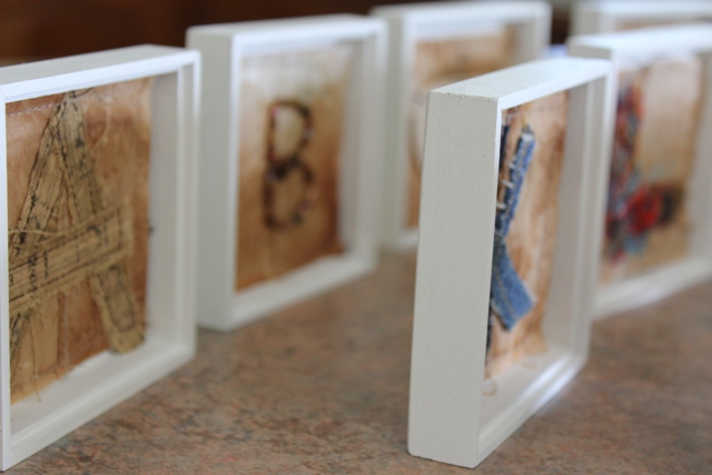
In wrapping up 2011 and almost finished my second alphabet, exploring the KISS Method (Keep It Simple Sweetheart) I chose to use recycled tea bags with what was at hand in my sewing room at the time of making each letter, to see all the juicy details on each letter visit ALaW


Wanting to display them individually I decided to showcase them within their own little box. I had some little wooden boxes made up and I've painted them white, now I'm just waiting on the glass to enclose them.


Snippet, of detailed photographs...


A - part of an ole' tape measure, K - denim scrap,


T - Lemon scented Gum leaf,


U - bread tag, V - an old embroidered patch,


X - recycled tea bag, and Y - cut from an image of star with rays.


The full alphabet together for a group detailed photo.


Now in it's second year running ALaW is about to launch into its third and is now open to newcomers for participation, if your interested click here to apply.

Saturday, January 1, 2011

ALaW 2010 - Alphabet two

I had two spare tiles left over, spares for 'just incase'. When working with clay it pays to make more than is needed, incase you make a mistake, drop or break one unintentionally. I must say it is not an easy task to reproduce another identical tile, the same thickness several months later.
A bit of fun, not sure if I'll use them or not.... could be useful for the final layout.

One more photo to share with you. I particularly like the result of staining the clay made on the plyboard I had them stored on, six months of aging...


ALaW - XYZ

XYZ Techniques....

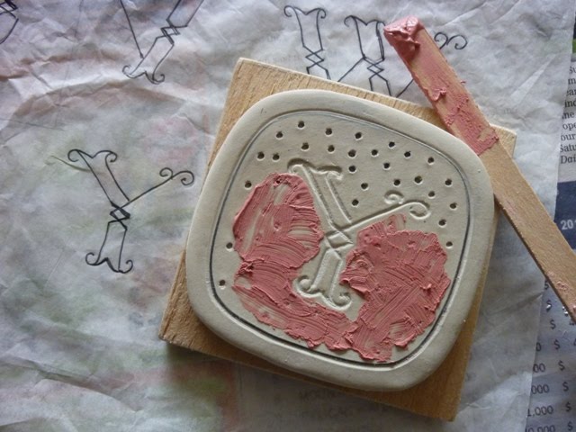
X - Inlay - with red porcelain slip
Y - Freehand marking - with red porcelain slip inlay
Z - Carving
The image is a tad small to see the detail, you can enlarge it by clicking on the image.

AlaW techniques for XYZ

It was like fast and furious to get all these letters finished today and posted! Seeing the third alphabet for ALaW 2011 starts this Monday. So, simple and sweet to wrap things up.
I chose to use my most favourite piece in this alphabet to finish the last two letters using that technique with clay inlay. It happens to be 'P' -dots created by the pointy end of a stick, well, a pencil really.
X - Inlay with red porcelain slip
Transfered the letter lightly onto the clay tile using the transfer paper, then X marks the spot, dots with the pencil. Filled with red porcelain slip, left to dry a little....

...and once touch dry - fast tracking here (it is usually left to dry then sanded) I've used a turning tool to scrap back the slip to reveal the red porcelain slip clay inlay. I will sand when dry to sharpen up the final result.

Y - Freehand marking with red porcelain slip inlay
All my letters to date have been previously marked onto the clay via transfering paper, this time I've loosened up and drawn the letter Y and border freehand with a pencil deeply imprinting the clay tile. The dots are undertaken the same method as with X; clay slip inlay.

All cleaned up looking like a pink polka dot dress! Although once fired the slip will turn red.

Last but not least Z.... I decided to end my alphabet using the same technique that I started the alphabet with, (with the letter 'A') by method of Carving.

Z - Carving

YAY! All done, now all I have to do is -bisque fire them - glaze them - and fire them to 1300*
Stay posted to see the final result....

ALaW - UVW

UVW Techniques...

U - Woodcut Print - with black underglaze
V - Negative Print - with red porcelain slip
W - Negative carving - with black underglaze (Reverse to V)

ALaW techniques for UVW

My last letters for ALaW 2010, somewhat overdue! 5 weeks to be exact, but who's counting...
U - Woodcut Print with underglaze
I've been at this one to conquer for sometime now, with each attempt amounting to dissapointment. And you could say that it was U that held up progress (plus xmas, new year etc...) to completing my ALaW in time. Not wanting it to get the better of me, I left it until I had optimine time to devote 100% head space to retry.
My adjustments I needed to re-address were (and many);
  • The initial carving needed to be deeper, so off to buy real (sharp) woodcut tools!
  • Always remember to carve your letter backwards, just as well the first attempt was a fizzer (and on a test tile).
  • Re-adjust the thinking to clay and not paper as in the workshop, of course Kim...this should have been your first thought, huh.
  • Using black underglaze (not ink) resulted in different tackiness, well no tackiness at all actually. Hence the printing ink roller was not suitable, out with the sponge roller, a test run, and wolla, yay, as easy as that!

The techniques for the next two letters are taken from this idea of the woodcut print process, minus or adding some steps to suit the clay.

V - Negative Print with red porcelain slip

Instead of carving into wood I've carved deeply and directly into the clay with a carving tool. Then with a sponge roller loaded with red porcleain slip, I've rolled over the clay tile to print a negative letter V. Being careful not to get any slip into the carved letter, as in the ink printing method.

W - Negative carving with black underglaze

Reverse to V - Instead of carving the letter first I carved it last. Using the sponge roller again, this time loaded with black underglaze I've rolled over the whole tile completely covering it with black. When touch dry I've transfered the letter W into the clay tile (gently) to make an imprint, then carved the letter and border.

Saturday, December 4, 2010

ALaW - T

The A Letter a Week (ALaW) challenge continues and is fast coming to an end of the second alphabet. Being totally focused on preparations for my next exhibition and extremely wet weather, I am now seriously lagging behind, we're already into December and I haven't finished the November letters! eeek, starting to feel a little under pressure!
T - Carving
Seeing all the common techniques I am familiar with have been used, I'm starting to use the same techniques in previous letters in a different manner, thinking outside the norm if practically possible.
Here I'm carving the clay out around the letter to create a three dimensional 'T', much more challenging than the A and N, where A I carved directly around the outline and N carved within the outline resulting a negative letter.

Sanded and ready for bisque.

Wednesday, November 10, 2010

ALaW - R S

R - Sgrafitto - with brushed on red slip

R is transfered onto the leatherhard clay tile in usual manner. Sgrafitto is generally a technique of scraping back into clay covered with slip, as seen with 'J' . I'm challenging logic with this one, letting go of rules and exploring, which some potters may ask "why?" I guess at this stage of the alphabet it's all about experiementing and I say why not! So instead of applying the slip I've just scraped into the clay body direct then brushed the red slip inside the R imprint and painted the border.

S - Imprint - with organic matter

A bit of fun, not sure what the end result will look like, fortunately I can rescue this if need be after the bisque firing. S transfered with a light pencil imprint as a guide, then wax emulsion applied to outline the letter and the border to act as a resist from the pressed in organic matter and to create a negative space with the letter, hopefully! In theory > the organic matter is pressed imprinting the clay and will burn away in the firing resulting inverted spots and the letter S will be revealed by the smooth surface.

Below is a close up for a clearer view - Quinoa grain is used and burnished in with my Tigers Eye polished stone for securing and reassuring a definite imprint.


Monday, November 1, 2010

ALaW - NOPQ

NOPQ - Techniques...
N - Carving - negative
O - Resist - with shellac & red slip
P - Imprint - with a needle tool
Q - Underglaze - washed back

Saturday, October 30, 2010

ALaw techniques for NOPQ

I've just about got to the pointy end of the stick for the most common techniques, so now time to deviate and explore...
N - Carving negative
I used the carving technique with 'A' and created a positive, this time trying for a negative at the leatherhard stage I carved the clay inside the letter rather than on the outer.
O - Resist with shellac & red slip
With the letter 'I' shellac and sponged back into the clay with water created a raised 3 dimensional letter. Here with 'O' shellac is used to resist the red porcelain slip. Theorically what I am trying to achieve is, in the bisque firing the shellac will burn out resulting an O and border clean of slip.
P - dots
No guessing where this idea came from... getting to the pointy end of the techniques! Very simple really and I like the look.

Q - underglaze washed back

One would ask! Why apply black underglaze to wipe back with a wet sponge on a white bodied porcelain when wanting to create a pure white ground as the final result? I asked myself the same question half way through. Q - proven to be the most challenging one in this set of letters I won't know my verdict until the final firing...

Tuesday, October 12, 2010

ALaW - JKLM

JKLM - Techniques...

J - Sgrafitto - burnished red porcelain slip
K - Stamping - foam and underglaze
L - Stamping - foam and porcleain slip
M - Underglaze - brushed on

ALaW - M

M - Underglaze - brushed on
Firstly, I transfered an imprint of the letter M onto the clay tile and using a very fine brush and a steady hand I've applied three coats of black underglaze. Three coats are necessary to achieve an even colour, if the application is not even a washed out look can result after the final firing which is not a good look.
Finished off with a solid colour border, ofcourse.....as it was easier to do three coats solid rather than attempting a fine line!
Sanded and ready for bisque.

Monday, October 11, 2010

ALaW - K L

K - Stamping - with foam and underglaze

Wanting to carve into foam I cut a square with a hacksaw blade. I first tried the dremel to shape a K, not to successful I might add! It just tore and grabbed at the foam. My second and successful attempt I used a hot soldering iron to melt away the foam.
After a few test runs and getting the correct consistency with the underglaze, I felt confident enough to stamp the K. The foam is pressed very lightly into the container of underglaze, a gentle hand is needed in both soaking up the colour to stamp and when stamping, so it doesn't go into the negative space and leave behind a blotchy letter.
Phew! All good, I had to hold my breath while doing this one!

L - Stamping - with foam and porcleain slip
Once again the letter is burnt out in the foam using a hot soldering iron (...carefully and not inhaling the toxic fumes!)* and is cut to make a square.

Reverse to the K tile, a thick and smooth porcelain slip is brushed onto the clay tile first. The foam sponge is gently pressed onto the tile to soak up the excess slip creating a nice texture surrounding and the letter is left smooth and slightly three dimensional. Extremely hard to see in this photo, a close look you can see the shiny bit being smooth.

Almost finished K & L, I intend to sharpen the lines on K with black underglaze in a fine nib bottle and outline the L (now bone dry is almost impossible to see).

*Hot soldering iron and foam is not really an ideal technique and I wouldn't use it again or recommend anyone to use it. As this is an exercise in experiementation was the only reason for attempting. I found it to be very challenging not to over melt the foam and toxic.